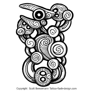
Logo and visitng card... first iteration
Well after a lot of trial runs i guess i got a good enough logo, as i mentioned yesterday the style of maori was in my head. I did a lot of researching, the pointed curves and intricate details made it so hard to replicate, i wanted to my logo be simple and at the same time different too. So these were some of my first works... sorry i took a screenshot using my mobile, this was in the college system.
After some more looking around i found more interesting designs that i can use, and so this logo was made...
Its an eye with some modifications and slanted, well when it was made slanted it looks like a mother holding a child, well thats just me... I started work on the visiting card design and well as i mentioned i wanted to keep things simple as possible and not to jam too many things in one page.
Well tomorrow i will show to Jai sir and see if this will be ok and then the design will be further refined.


Comments
Post a Comment